Below are examples of digital graphic designs based on Module 1: Project 1: Bitmap and Vector Imagery.
Part 1 consisted of a digital book cover (bitmap imagery) using GIMP. Part 2 consisted of designing
a logo (vector imagery) using Inkscape. Click below the image to view more details for each artwork.

Book Cover and logo vector graphic


Leaders Eat Last Book Cover


Book Cover: Leaders Eat Last


The book I selected for the book cover portion is “Leaders Eat Last” by Simon Sinek, which I am currently reading. It is an inspiring book that engages the reader with thought provoking stories and challenges the reader to embrace different concepts of leadership. The title of this book comes from one of the successful leadership behaviors in the United States Marine Corps (USMC) which says that officers eat last. Real leaders, indeed, put others before themselves.

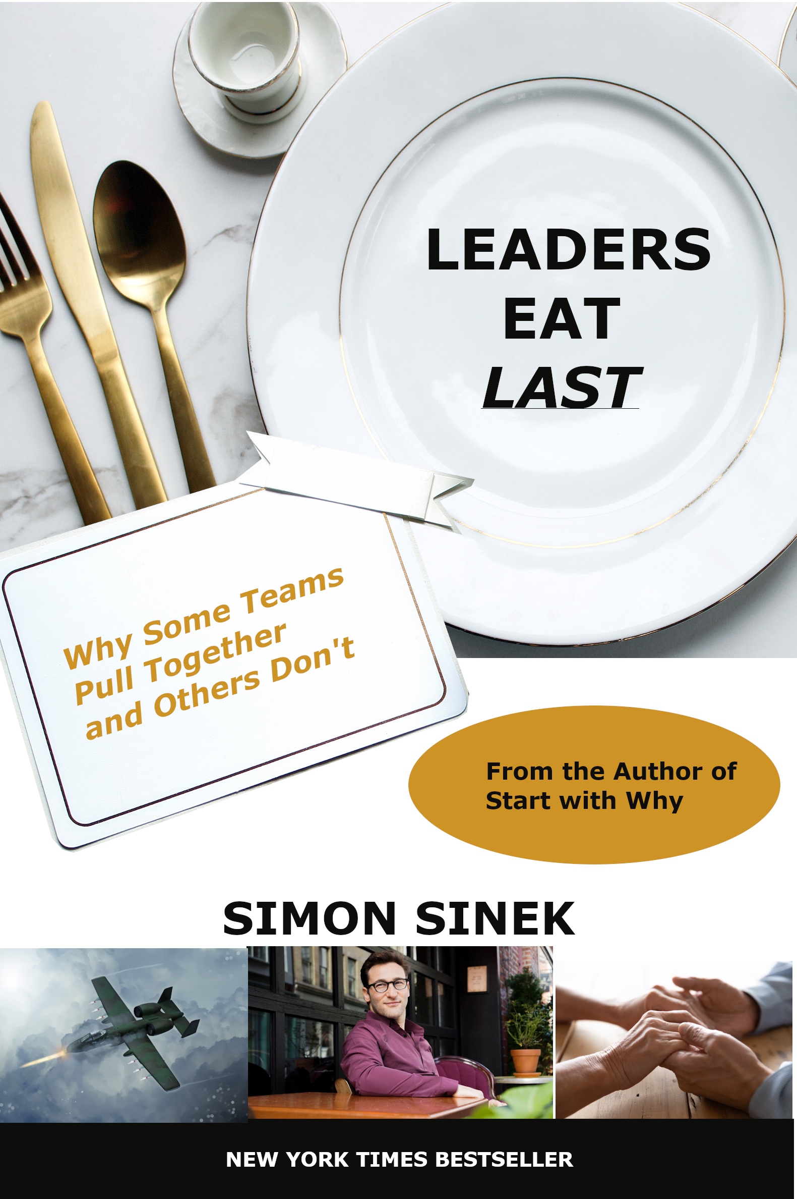
I used the actual dimensions of the paperback book (5.27 x 0.92 x 7.92 inches) as the starting canvas in GIMP. All the images I used were from Shutterstock (A-10 Warthog, Holding Hands, and two formal dining images). The picture of the author was provided by the author of his site, available for free download/public use.

The plate setting is relevant to the title of the book but it literally both a symbol of actual demonstrate leadership in the book. I merged two of the stockphotos containing the formal dining plate setting- 1 that combined the dinner card and the other an empty plate. The original image with the dining card had the utensils on the plate, and the 2nd image had the empty plate with the golden utensils on the side. I needed the empty plate so that I could place the title over the plate. I wanted to convey the title on the plate to remind the reader that “Leaders Eat Last” (next time they are sitting down to eat). I added a subtle underline on “LAST” as a slight emphasis. I wrote the book’s sub-title on the dinner card which describes the book: “Why Some Teams Pull Together and Others Don’t.”

The three smaller photos are relevant to the book. The picture of the author is at the center (sitting at a table looking at the reader) and placed directly under his name. The left image is an A-10 Warthog firing its weapon. This imagery conveys the powerful, true story and opening scene of the book of courage by A-10 pilots, supporting special forces on the ground. The right image is a visual and symbol of empathy. Believe it or not, both the left image and right image are related in terms of both symbols and tangible demonstration of empathy.

I added additional details to include the information from the real cover. I added an ellipses with text containing text: “From the Author of Start with Why.” Finally, I added a black border at the bottom with white text containing “New York Times Bestseller.”

Graphic Logo


Intuicient


Company Logo Design: Intuicient


The logo I created in Inkscape was for a fictitious tech company called “Intuicient.” Derived by combining a part of the words “intuition” and “efficient,” it is actually a name that I’ve thought of a while back and reserved the domain name. While the name is not simple (it’s 4 syllables!), I’d like to think it could convey ”effortless mastery” and “flow.” The concept of the company is quite broad and fluid- either involved with data analytics and/or AI. It could also serve as an intuitive learning platform or research/consultancy group.

As for the logo, I wanted to convey calm and bold. I wanted both simple and subtle, yet have impact and motion. At the same time, I would imagine the logo evolving over time as many logos do (simplifying and transitioning as the company transforms over time).

The initial design looked at smooth stones or stacked pebbles which conveyed balance and calm. I also imagined skipping the pebbles across a pond that would create a ripple. The background story is that pebbles symbolize pieces of information. I also visualized animation of a pebble being thrown from right to left hitting and dotting the 3 i’s, however, I decided that would be too much. I liked the symbol of a ripple and how information can ripple out. Instead of a pebble, I exchanged it for a drop of water over the ripple.

Next, I attempted to create a water drop splashing into the water and rippling out. A number of pictures (on Google Photos) show this well, and I attempted to turn it as a symbol of a dotted ‘i’ effect but this illustration did not work so well, so I decided to forgo that. The drop of water was created by using two circles with a dark blue stroke and a grayish, blue fill. I slightly spaced out the circles to create a subtle shade effect. The ripples were created by using circles and reshaping them into an ellipse of various sizes, fill colors, and stroke colors. In all, I used about 7 circles to create the effect. I purposely did not want perfectly concentric ovals, instead opting for slight overlap (and slight off-centered) to create an effect of motion.

Initially, I tried using different shades of blue but it was hard to determine the gradients as they all blended in together. Instead, I went with a subtle pink/purple combination for the outer ring and a dark magenta to add some boldness. It also seems as if the ripples emanate outward. A test printout showed that this worked well especially when looking at it from a further distance. Ultimately, this also passed the “kid test” when I asked my ten year old son what he thought it was. His response was “water.”

For the text, I wanted simple and clean so I selected a sans-serif font - Helvetica. I tried black as a standard color but felt the shade of blue from the logo connected well. In letter casing, I experimented. I tried all uppercase or capitalizing the first ‘I’ but felt all lower case resonated well.

In terms of taglines/slogans, I tried playing with different ones but decided not to add any. I think something like “Intuition at speed” would work well at the bottom of the logo and name that would help with branding (e.g. online, business cards and other print collateral).